If you follow along in the design world I’m sure you’ve heard that Pantone has introduced their color of the year for 2013 as Emerald. But you may be wondering… what exactly does this mean?
Pantone is a standardized system that is used to match colors based on their numeric system. From interiors to fashion, designers from all areas use Pantone to communicate their vision.
Every year, they introduce their “color of the year” which will guide designer’s creations in fabrics, graphics, interiors and fashion. Here are some excellent examples of how this dramatic hue can be infused into an interior to create a big impact. {source}
Emerald looks fabulous with black and white patterns and shimmers of gold. {source} & {source} and this headboard is stunning and pops against the toile paper background in an identical shade. {source}
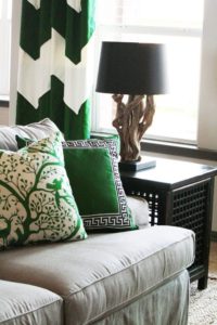
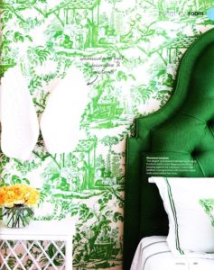
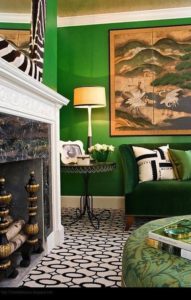
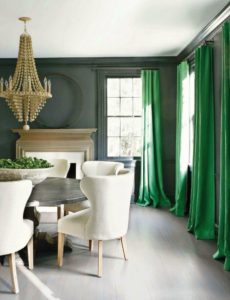
{source}Pops of this bold color also make a dramatic statement. Use it in pillows, accessories, or even window panels. As we’ve seen it looks great up against bold neutrals.
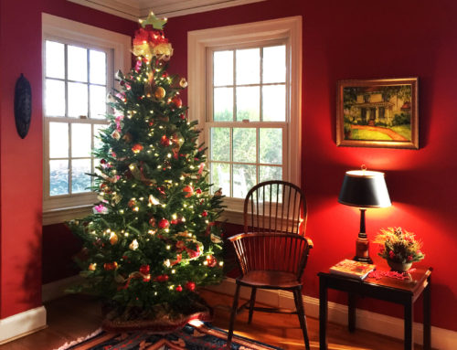
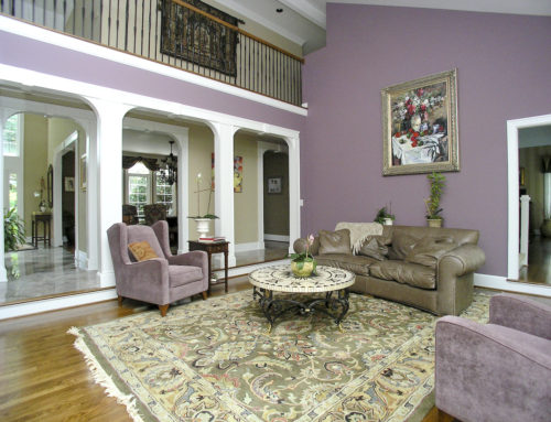
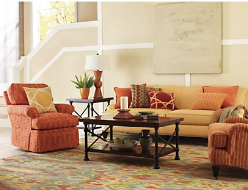
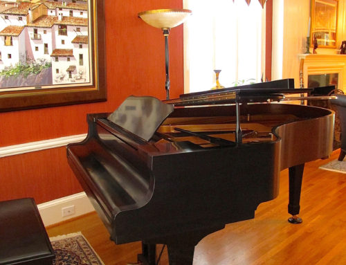
As shown in the pictures, this color is great in any space. It could be used as a paint color or as the fabric for a piece of furniture.
Have you used this color in your home? Would you? How about in your wardrobe? Share your thoughts, we’d love to hear!

